
- Android获取当前手机网络类型(2g、3g、4g、wifi)以及手机型号、版本号代码
- Android查看电池电量的方法(基于BroadcastReceiver)
- Android开发之activiti节点跳转
- Android自定义ListView实现下拉刷新
- Android App中使用AudioManager类来编写音频播放器
- Android开发笔记之探秘WebView
- android 多点触摸图片缩放的具体实现方法
- Android中打电话的数据流程分析
- Android开发中Activity属性设置小结
- 基于Android 错误信息捕获发送至服务器的详解
- Android简单音乐播放实例
- android编程判断应用是否具有某个权限的方法
- Android RelativeLayout相对布局属性简析
- Android实现顶部导航菜单左右滑动效果
- Android编程实现检测当前电源状态的方法
- Android中Service(后台服务)详解
- Android 网络状态实时监听代码实例(一)
- Android界面切换出现短暂黑屏的解决方法
- Android使用缓存机制实现文件下载及异步请求图片加三级缓存
- Handler与Android多线程详解
- Android下拉列表(Spinner)效果(使用C#和Java分别实现)
- android使用videoview播放视频
- Android实现中文按拼音排序方法
- Android项目实战之仿网易顶部导航栏效果
- Android编程实现改变控件背景及形态的方法
- Android执行shell命令详解
- Android程序开发之UIScrollerView里有两个tableView
- Android调用系统时间格式显示时间信息
- Android仿腾讯QQ实现滑动删除 附源码下载
- Android隐藏标题状态栏的方法
Android UI设计系列之自定义TextView属性实现带下划线的文本框(4)
在Android开发过程中,如果Android系统自带的属性不能满足我们日常开发的需求,那么就需要我们给系统控件添加额外的属性了。假如有个需求是实现带下划线的文本显示(下划线),如果不使用自定义属性的话实现起来也不太难(起码我认为的实现方式是有许多种的),今天就讲解一下如何使用自定义属性来实现上述带下划线的文本框吧。还好Android中自定义属性不是很复杂,也可以归纳为三步走吧。
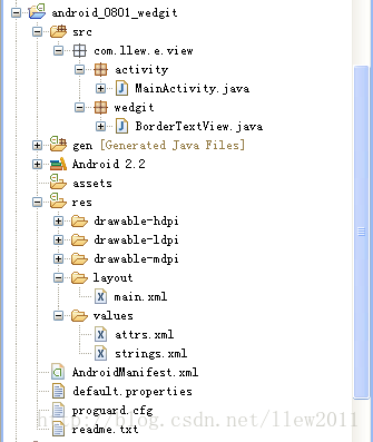
老规矩,还是先贴出工程目录吧:
一、添加属性文件
在values文件夹中新建attrs.xml文件,在文件中新建属性文件,代码如下:
<?xml version="1.0" encoding="utf-8"?>
<resources>

 <!-- 自定义属性开始 -->
 <declare-styleable name="BorderTextView">
  <attr name="layout_borders" format="boolean"></attr>
  <attr name="layout_borderLeft" format="boolean"></attr>
  <attr name="layout_borderTop" format="boolean"></attr>
  <attr name="layout_borderRight" format="boolean"></attr>
  <attr name="layout_borderBottom" format="boolean"></attr>
 </declare-styleable>
 <!-- 自定义属性结束 -->

</resources>
其中需要说明的是,自定义属性文件的根节点页是<resources>,在根节点内创建你所需要的属性值,自定义属性的节点是以<declare-styleable>开始的,它表示的是个属性集可以包含众多属性,其中name="BorderTextView"是属性集名。接着在<declare-styleable>中定义我们需要的以<attr>为节点的属性,attr表示属性的意思name表示当前属性的名称,format表示的是属性值的类型,例如我们当前定义的属性类型为boolean类型,也就是说当前定义的属性取值只能为boolean类型的,format可以表示的的类型有好多种,最常见的如:string,boolean,integer,dimension,reference等这,里就不再详细讲解了,如果谁有疑问,可以自己动手问问度娘,她知道的比我多,呵呵
二、使用自定义属性
在attrs.xml文件中定义好了属性,就可以在布局文件中使用了,接下来看看在布局文件中如何使用自定义属性吧,代码如下:
<?xml version="1.0" encoding="utf-8"?>
<LinearLayout
 xmlns:android="http://schemas.android.com/apk/res/android"
 xmlns:greendroid="http://schemas.android.com/apk/res/com.llew.e"
 android:orientation="vertical"
 android:layout_width="fill_parent"
 android:background="#ffffff"
 android:layout_height="fill_parent">
 <TextView
  android:layout_width="fill_parent"
  android:layout_height="wrap_content"
  android:layout_margin="10dip"
  android:text="@string/hello"
  android:textColor="#000000" />

 <com.llew.e.view.wedgit.BorderTextView
  android:layout_width="wrap_content"
  android:layout_height="wrap_content"
  android:text="左侧带有边框"
  android:layout_margin="10dip"
  greendroid:layout_borderLeft="true"
  android:textSize="20sp"
  android:textColor="#aabbcc">
 </com.llew.e.view.wedgit.BorderTextView>

 <com.llew.e.view.wedgit.BorderTextView
  android:layout_width="wrap_content"
  android:layout_height="wrap_content"
  android:text="顶部带有边框"
  android:layout_margin="10dip"
  greendroid:layout_borderTop="true"
  android:textSize="20sp"
  android:textColor="#bbccaa">
 </com.llew.e.view.wedgit.BorderTextView>

 <com.llew.e.view.wedgit.BorderTextView
  android:layout_width="wrap_content"
  android:layout_height="wrap_content"
  android:text="右侧带有边框"
  android:layout_margin="10dip"
  greendroid:layout_borderRight="true"
  android:textSize="20sp"
  android:textColor="#ccaabb">
 </com.llew.e.view.wedgit.BorderTextView>

 <com.llew.e.view.wedgit.BorderTextView
  android:layout_width="wrap_content"
  android:layout_height="wrap_content"
  android:text="底部带有边框"
  android:layout_margin="10dip"
  greendroid:layout_borderBottom="true"
  android:textSize="20sp"
  android:textColor="#abcabc">
 </com.llew.e.view.wedgit.BorderTextView>

 <com.llew.e.view.wedgit.BorderTextView
  android:layout_width="wrap_content"
  android:layout_height="wrap_content"
  android:text="四周带有边框"
  android:layout_margin="10dip"
  greendroid:layout_borders="true"
  android:textSize="20sp"
  android:textColor="#cbacba">
 </com.llew.e.view.wedgit.BorderTextView>
</LinearLayout>
使用自定义控件也很简单就是包名+自定义控件名,为了使用我们自定义的属性,必须在布局文件的根节点中加上xmlns:greendroid="http://schemas.android.com/apk/res/com.llew.e"这句话,其中xmlns:greendroid表示的是命名空间名称,greendroid只是个名字是我们使用自定义属性的前缀,可以随便取值(只要不是android就行了),com.llew.e是在manifest中的package的对应值,使用自定义属性就想代码中的那样:greendroid:layout_borderLeft="true",(*^__^*) 嘻嘻……,是不是可简单?
三、根据自定义属性值做相应操作
完成自定义属性文件之后,我们就来为控件添加自定义的属性了,自定义控件我认为最简单的实现就是使用继承,在继承的基础上进行扩充来实现我们所要的功能,所以为了实现带边框的文本组件,我就直接继承了TextView组件,在它的基础上进行扩充了,代码如下:
public class BorderTextView extends TextView {

 /**
  * 四周是否带有边框【true:四周带有边框】【false:四周不带边框】
  */
 boolean borders = false;
 /**
  * 左边是否带有边框【true:左侧带有边框】【false:左侧不带边框】
  */
 boolean borderLeft = false;
 /**
  * 顶部是否带有边框【true:顶部带有边框】【false:底部不带边框】
  */
 boolean borderTop = false;
 /**
  * 右侧是否带有边框【true:右侧带有边框】【false:右侧不带边框】
  */
 boolean borderRight = false;
 /**
  * 底部是否带有边框【true:底部带有边框】【false:底部不带边框】
  */
 boolean borderBottom = false;
 /**
  * 边框颜色
  */
 String textColor = "#ff000000";

 public BorderTextView(Context context) {
  this(context, null);
 }

 public BorderTextView(Context context, AttributeSet attrs) {
  this(context, attrs, android.R.attr.textViewStyle);
 }

 public BorderTextView(Context context, AttributeSet attrs, int defStyle) {
  super(context, attrs, defStyle);
  // 获取自定义属性集
  TypedArray typedArray = context.obtainStyledAttributes(attrs,
    R.styleable.BorderTextView);
  // 是否设置全部边框,默认为false
  borders = typedArray.getBoolean(
    R.styleable.BorderTextView_layout_borders, false);
  // 是否设置左侧边框,默认为false
  borderLeft = typedArray.getBoolean(
    R.styleable.BorderTextView_layout_borderLeft, false);
  // 是否设置顶部边框,默认为false
  borderTop = typedArray.getBoolean(
    R.styleable.BorderTextView_layout_borderTop, false);
  // 是否设置右侧边框,默认为false
  borderRight = typedArray.getBoolean(
    R.styleable.BorderTextView_layout_borderRight, false);
  // 是否设置底部边框,默认为false
  borderBottom = typedArray.getBoolean(
    R.styleable.BorderTextView_layout_borderBottom, false);
  // 获取文本颜色值,用来画边框的,便于和文本颜色匹配
  textColor = attrs.getAttributeValue(
    "http://schemas.android.com/apk/res/android", "textColor");
  typedArray.recycle();
 }

 @Override
 public void draw(Canvas canvas) {
  super.draw(canvas);
  // 创建画笔
  Paint paint = new Paint();
  // 获取该画笔颜色
  int color = paint.getColor();
  // 设置画笔颜色
  paint.setColor(Color.parseColor(textColor));
  // 如果borders为true,表示左上右下都有边框
  if (borders) {
   canvas.drawLine(0, 0, 0, this.getHeight() - 1, paint);
   canvas.drawLine(0, 0, this.getWidth() - 1, 0, paint);
   canvas.drawLine(this.getWidth() - 1, 0, this.getWidth() - 1,
     this.getHeight() - 1, paint);
   canvas.drawLine(0, this.getHeight() - 1, this.getWidth() - 1,
     this.getHeight() - 1, paint);
  } else {
   if (borderLeft) {
    // 画左边框线
    canvas.drawLine(0, 0, 0, this.getHeight() - 1, paint);
   }
   if (borderTop) {
    // 画顶部边框线
    canvas.drawLine(0, 0, this.getWidth() - 1, 0, paint);
   }
   if (borderRight) {
    // 画右侧边框线
    canvas.drawLine(this.getWidth() - 1, 0, this.getWidth() - 1,
      this.getHeight() - 1, paint);
   }
   if (borderBottom) {
    // 画底部边框线
    canvas.drawLine(0, this.getHeight() - 1, this.getWidth() - 1,
      this.getHeight() - 1, paint);
   }
  }
  // 设置画笔颜色归位
  paint.setColor(color);
 }
}
其实给BorderTextView添加边框也是很简单,原理就是其draw方法中绘画出边框罢,我们都知道每一个View控件在屏幕上显示出来大致可以归纳为三大步骤,首先调用View控件的onMesure方法,其次调用View控件的onLayout方法,再次调用View控件的onDraw方法,所以我们只需要在draw方法中绘制出边框就行了,绘制边框的步骤很简单,代码注释也很详细,就不再详细讲解了
最后运行一下程序来看一下效果图吧,呵呵
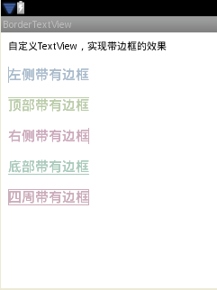
好了,今天的自定义属性实现带边框的TextView控件就讲解完了,谢谢大家的阅读。
源码下载:Android UI实现带下划线的文本框
以上就是本文的全部内容,希望对大家的学习有所帮助,也希望大家多多支持脚本之家。
- android开发socket编程之udp发送实例分析
- Android中AlertDialog用法实例分析
- Android 获取屏幕高度,标题高度,状态栏高度
- Android实现歌曲播放时歌词同步显示具体思路
- Android中Intent机制详解及示例总结(总结篇
- Android SDK在线更新镜像服务器大全
- Android编程中@id和@+id的区别分析