
- 解析android res 运行错误的问题
- Android相机、图册demo
- 在android中实现类似uc和墨迹天气的左右拖动效果
- android判断动画已结束示例代码
- android 引导界面的实现方法
- Android操作存放在assets文件夹下SQLite数据库的方法
- Android编程之客户端通过socket与服务器通信的方法
- [Java4Android]01_Java考古学
- Android桌面插件App Widget用法分析
- Android开发之将两张图片合并为一张图片的方法
- Android UI效果之绘图篇(一)
- 基于android样式与主题(style&theme)的详解
- 模仿美团点评的Android应用中价格和购买栏悬浮固定的效果
- Android ProgressBar进度条使用详解
- Android自定义View之酷炫圆环(二)
- Android中使用SQLite3 命令行查看内嵌数据库的方法
- Android实现手势滑动多点触摸缩放平移图片效果(二)
- Android编程开发之性能优化技巧总结
- android开发教程之ubuntu使用adb连接小米2的步骤和adb调试方法
- Android编程开发音乐播放器实例
- Android 屏幕截屏方法汇总
- Android Notification通知解析
- Android 全屏无标题栏的三种实现方法
- Android应用中实现选择本地文件与目录的实例分享
- android POST数据遇到的UTF-8编码(乱码)问题解决办法
- 解决Android模拟器端口被占用问题的办法
- Android 游戏开发中绘制游戏触摸轨迹的曲线图
- 详解Android应用中DialogFragment的基本用法
- Android抢红包助手开发全攻略
- Android编程之简单逐帧动画Frame的实现方法
Android自定义控件之组合控件学习笔记分享
作者:佚名 Android开发编辑:admin 更新时间:2022-07-23
我们来讲一下自定义组合控件,相信大家也接触过自定义组合控件吧,话不多说,直接干(哈~哈~):
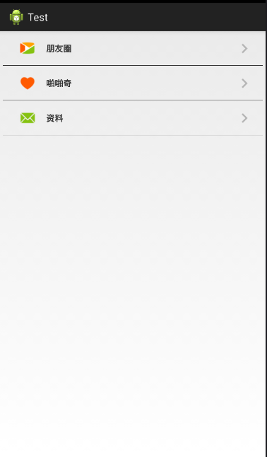
大家看到这个觉得这不是很简单的吗,这不就是写个布局文件就搞定嘛,没错,确实直接上布局就行,不过,我只是用这个简单的例子来讲一下自定义组合控件的用法。
首先看看,这一行行的条目看起来都长得差不多,只是图片和文字不一样,没错,就是看中这一点,我们可以把一个条目做成一个组合控件,做为一个整体,这样不管你有几个条目,就写几个组合控件就行了。
步骤:
1.先建立组合控件的布局
myView.xml
<RelativeLayout xmlns:android="http://schemas.android.com/apk/res/android"
 android:layout_width="match_parent"
 android:layout_height="60dp" >

 <ImageView
  android:id="@+id/icon_Iv"
  android:layout_width="35dp"
  android:layout_height="35dp"
  android:layout_centerVertical="true"
  android:layout_marginLeft="30dp"
  android:src="@drawable/phone_qiyi_explore_friends" />

 <TextView
  android:id="@+id/tv"
  android:layout_width="wrap_content"
  android:layout_height="match_parent"
  android:layout_marginLeft="80dp"
  android:gravity="center"
  android:text="朋友圈"
  android:textSize="15sp"
  android:textStyle="bold" />

 <ImageView
  android:layout_width="wrap_content"
  android:layout_height="match_parent"
  android:layout_alignParentRight="true"
  android:layout_marginRight="20dp"
  android:src="@drawable/phone_my_inc_arrow" />

 <View
  android:layout_width="match_parent"
  android:layout_height="0.5dp"
  android:layout_alignParentBottom="true"
  android:layout_marginLeft="5dp"
  android:layout_marginRight="5dp"
  android:background="#000" />

</RelativeLayout>
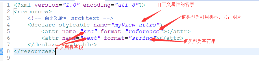
2.自定义属性(图片资源和文本)
在values/目录下新建attrs.xml文件
attrs.xml:
<?xml version="1.0" encoding="utf-8"?>
<resources>
 <!-- 自定义属性:src和text -->
 <declare-styleable name="myView_attrs">
  <attr name="src" format="reference"></attr>
  <attr name="text" format="string"></attr>
 </declare-styleable>
</resources>
3.新建一个类MyView继承RelativeLayout,将自定义的布局文件加载进来并且获取自定义的属性,然后取得自定义属性字段的值,最后将相应的值设置在相应的组件上
/**
 * 自定义组合控件(包括一个ImageView和TextView)
 * @author Administrator
 *
 */
public class MyView extends RelativeLayout{

 private TextView tv;
 private ImageView icon_Iv;
 public MyView(Context context) {
  this(context,null);
 }
 public MyView(Context context, AttributeSet attrs) {
  super(context, attrs);
  initView(context);
  //拿到自定义的属性
  TypedArray ta = context.obtainStyledAttributes(attrs, R.styleable.myView_attrs);
  //获取自定义属性的值
  String text = ta.getString(R.styleable.myView_attrs_text);
  Drawable drawable = ta.getDrawable(R.styleable.myView_attrs_src);
  //把值设置到相应组件上
  icon_Iv.setImageDrawable(drawable);
  tv.setText(text);
 }
 private void initView(Context context) {
  //把自定义的布局加载进来
  View.inflate(context,R.layout.myview,this);
  //找到布局中的组件
  icon_Iv = (ImageView) this.findViewById(R.id.icon_Iv);
  tv = (TextView) this.findViewById(R.id.tv);

 }
}
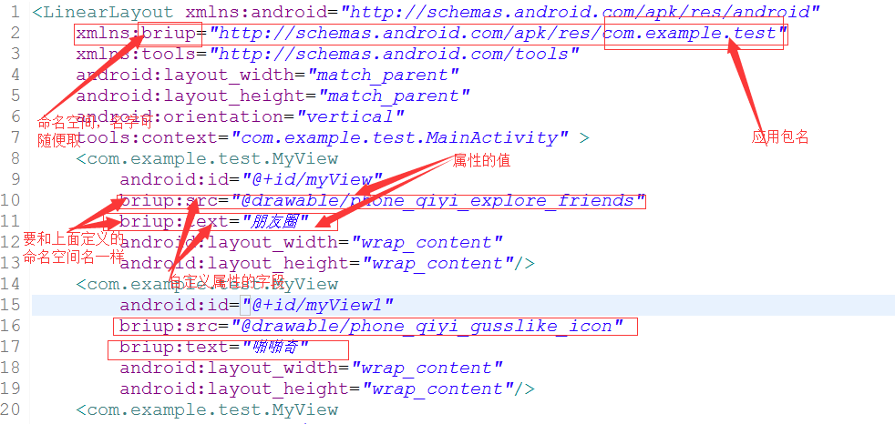
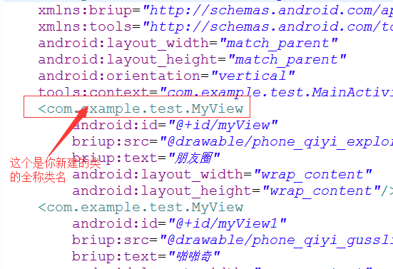
4.在main.xml文件中添加自定义组合控件
注:记得加上命名空间
有几个条目就加几个控件
main.xml:
<LinearLayout xmlns:android="http://schemas.android.com/apk/res/android xmlns:briup="http://schemas.android.com/apk/res/com.example.test"
 xmlns:tools="http://schemas.android.com/tools"
 android:layout_width="match_parent"
 android:layout_height="match_parent"
 android:orientation="vertical"
 tools:context="com.example.test.MainActivity" >
 <com.example.test.MyView
  android:id="@+id/myView"
  briup:src="@drawable/phone_qiyi_explore_friends"
  briup:text="朋友圈"
  android:layout_width="wrap_content"
  android:layout_height="wrap_content"/>
 <com.example.test.MyView
  android:id="@+id/myView1"
  briup:src="@drawable/phone_qiyi_gusslike_icon"
  briup:text="啪啪奇"
  android:layout_width="wrap_content"
  android:layout_height="wrap_content"/>
 <com.example.test.MyView
  android:id="@+id/myView2"
  briup:text="消息"
  briup:src="@drawable/phone_qiyi_message_icon"
  android:layout_width="wrap_content"
  android:layout_height="wrap_content"/>
</LinearLayout>
注:
做到以上步骤就可以了,希望本文所述对大家学习Android自定义控件有所帮助。
- 上一篇文章: Android仿优酷圆形菜单学习笔记分享
- 下一篇文章: Android创建和使用数据库SQLIte
- Android支付宝支付设计开发
- android开发教程之handler异步更新ui
- [Java4Android]04_Java的变量
- Android App开发中将View或Drawable转为Bit
- Android项目中引用本地aar文件的方法
- Android中通过AsyncTask类来制作炫酷进度条
- Android 日志系统Logger源代码详细介绍