
- android ListView深入理解
- Android开发实现TextView显示丰富的文本
- 利用smsmanager实现后台发送短信示例
- 解析android中系统日期时间的获取
- Android 简单的照相机程序的实例代码
- android 放大镜ShapeDrawable妙用分享
- Android自定义View仿QQ健康界面
- Android开发之ImageLoader本地缓存
- android实现静默安装与卸载的方法
- Android实现粒子爆炸效果的方法
- Android App中的GridView网格布局使用指南
- [Android开发视频教学]01_04_Activity初步
- Android App中使用ViewPager+Fragment实现滑动切换效果
- 详解Android Activity之间切换传递数据的方法
- Android自定义ProgressDialog加载图片
- Android中使用Toast.cancel()方法优化toast内容显示的解决方法
- 深入理解Android中的Handler异步通信机制
- Android开发笔记之图片缓存、手势及OOM分析
- Android SQLite详解及示例代码
- android开发之横向滚动/竖向滚动的ListView(固定列头)
- Android开发自学笔记(四):APP布局下
- Android 按指定大小读取图片的实例
- Android读取用户号码,手机串号,SIM卡序列号的实现代码
- android监听安装和卸载示例
- 移动端WebApp隐藏地址栏的方法
- mac开发android环境搭建步骤图解
- Android ListView的item背景色设置和item点击无响应的解决方法
- Android中获取电池电量实例代码
- [Android开发从零开始].25.数据存储(4)
- Android入门之TabHost与TabWidget实例解析
Android中自定义View实现圆环等待及相关的音量调节效果
作者:佚名 Android开发编辑:admin 更新时间:2022-07-23
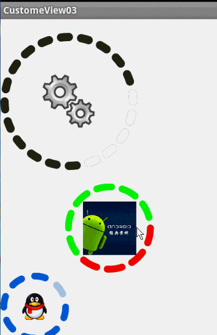
圆环交替、等待效果
效果就这样,分析了一下,大概有这几个属性,两个颜色,一个速度,一个圆环的宽度。
自定View的几个步骤:
1、自定义View的属性
2、在View的构造方法中获得我们自定义的属性
3、重写onMesure
4、重写onDraw
1、自定义属性:
<?xml version="1.0" encoding="utf-8"?>
<resources>

  <attr name="firstColor" format="color" />
  <attr name="secondColor" format="color" />
  <attr name="circleWidth" format="dimension" />
  <attr name="speed" format="integer" />

  <declare-styleable name="CustomProgressBar">
    <attr name="firstColor" />
    <attr name="secondColor" />
    <attr name="circleWidth" />
    <attr name="speed" />
  </declare-styleable>

</resources>
2、在View的构造方法中获得我们自定义的属性
/**
   * 第一圈的颜色
   */
  private int mFirstColor;
  /**
   * 第二圈的颜色
   */
  private int mSecondColor;
  /**
   * 圈的宽度
   */
  private int mCircleWidth;
  /**
   * 画笔
   */
  private Paint mPaint;
  /**
   * 当前进度
   */
  private int mProgress;

  /**
   * 速度
   */
  private int mSpeed;

  /**
   * 是否应该开始下一个
   */
  private boolean isNext = false;

  public CustomProgressBar(Context context, AttributeSet attrs)
  {
    this(context, attrs, 0);
  }

  public CustomProgressBar(Context context)
  {
    this(context, null);
  }

  /**
   * 必要的初始化,获得一些自定义的值
   *
   * @param context
   * @param attrs
   * @param defStyle
   */
  public CustomProgressBar(Context context, AttributeSet attrs, int defStyle)
  {
    super(context, attrs, defStyle);
    TypedArray a = context.getTheme().obtainStyledAttributes(attrs, R.styleable.CustomProgressBar, defStyle, 0);
    int n = a.getIndexCount();

    for (int i = 0; i < n; i++)
    {
      int attr = a.getIndex(i);
      switch (attr)
      {
      case R.styleable.CustomProgressBar_firstColor:
        mFirstColor = a.getColor(attr, Color.GREEN);
        break;
      case R.styleable.CustomProgressBar_secondColor:
        mSecondColor = a.getColor(attr, Color.RED);
        break;
      case R.styleable.CustomProgressBar_circleWidth:
        mCircleWidth = a.getDimensionPixelSize(attr, (int) TypedValue.applyDimension(
            TypedValue.COMPLEX_UNIT_PX, 20, getResources().getDisplayMetrics()));
        break;
      case R.styleable.CustomProgressBar_speed:
        mSpeed = a.getInt(attr, 20);// 默认20
        break;
      }
    }
    a.recycle();
    mPaint = new Paint();
    // 绘图线程
    new Thread()
    {
      public void run()
      {
        while (true)
        {
          mProgress++;
          if (mProgress == 360)
          {
            mProgress = 0;
            if (!isNext)
              isNext = true;
            else
              isNext = false;
          }
          postInvalidate();
          try
          {
            Thread.sleep(mSpeed);
          } catch (InterruptedException e)
          {
            e.printStackTrace();
          }
        }
      };
    }.start();

  }
3、直接重写onDraw,这不需要重写onMeasure
@Override
  protected void onDraw(Canvas canvas)
  {

    int centre = getWidth() / 2; // 获取圆心的x坐标
    int radius = centre - mCircleWidth / 2;// 半径
    mPaint.setStrokeWidth(mCircleWidth); // 设置圆环的宽度
    mPaint.setAntiAlias(true); // 消除锯齿
    mPaint.setStyle(Paint.Style.STROKE); // 设置空心
    RectF oval = new RectF(centre - radius, centre - radius, centre + radius, centre + radius); // 用于定义的圆弧的形状和大小的界限
    if (!isNext)
    {// 第一颜色的圈完整,第二颜色跑
      mPaint.setColor(mFirstColor); // 设置圆环的颜色
      canvas.drawCircle(centre, centre, radius, mPaint); // 画出圆环
      mPaint.setColor(mSecondColor); // 设置圆环的颜色
      canvas.drawArc(oval, -90, mProgress, false, mPaint); // 根据进度画圆弧
    } else
    {
      mPaint.setColor(mSecondColor); // 设置圆环的颜色
      canvas.drawCircle(centre, centre, radius, mPaint); // 画出圆环
      mPaint.setColor(mFirstColor); // 设置圆环的颜色
      canvas.drawArc(oval, -90, mProgress, false, mPaint); // 根据进度画圆弧
    }

  }
大功完成了,当然了,唯一比较纠结的地方就是两个颜色何时切换,如何切换,我采用上面的办法,你也可以自己想想怎么实现。
视频音量调控
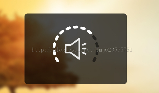
这样一个效果使用自定义View来实现的话和圆环的思路差不多,所以我们一起来看:
1、先分许需要的属性,两个小块的颜色、一张中间的图片、间隙大小、一个多少个块块。分析完毕,开始写attr.xml
<?xml version="1.0" encoding="utf-8"?>
<resources>

  <attr name="firstColor" format="color" />
  <attr name="secondColor" format="color" />
  <attr name="circleWidth" format="dimension" />
  <attr name="dotCount" format="integer" />
  <attr name="splitSize" format="integer" />
  <attr name="bg" format="reference"></attr>

  <declare-styleable name="CustomVolumControlBar">
    <attr name="firstColor" />
    <attr name="secondColor" />
    <attr name="circleWidth" />
    <attr name="dotCount" />
    <attr name="splitSize" />
    <attr name="bg" />
  </declare-styleable>

</resources>
2、在构造中获取这些属性:
/**
   * 第一圈的颜色
   */
  private int mFirstColor;

  /**
   * 第二圈的颜色
   */
  private int mSecondColor;
  /**
   * 圈的宽度
   */
  private int mCircleWidth;
  /**
   * 画笔
   */
  private Paint mPaint;
  /**
   * 当前进度
   */
  private int mCurrentCount = 3;

  /**
   * 中间的图片
   */
  private Bitmap mImage;
  /**
   * 每个块块间的间隙
   */
  private int mSplitSize;
  /**
   * 个数
   */
  private int mCount;

  private Rect mRect;

  public CustomVolumControlBar(Context context, AttributeSet attrs)
  {
    this(context, attrs, 0);
  }

  public CustomVolumControlBar(Context context)
  {
    this(context, null);
  }

  /**
   * 必要的初始化,获得一些自定义的值
   *
   * @param context
   * @param attrs
   * @param defStyle
   */
  public CustomVolumControlBar(Context context, AttributeSet attrs, int defStyle)
  {
    super(context, attrs, defStyle);
    TypedArray a = context.getTheme().obtainStyledAttributes(attrs, R.styleable.CustomVolumControlBar, defStyle, 0);
    int n = a.getIndexCount();

    for (int i = 0; i < n; i++)
    {
      int attr = a.getIndex(i);
      switch (attr)
      {
      case R.styleable.CustomVolumControlBar_firstColor:
        mFirstColor = a.getColor(attr, Color.GREEN);
        break;
      case R.styleable.CustomVolumControlBar_secondColor:
        mSecondColor = a.getColor(attr, Color.CYAN);
        break;
      case R.styleable.CustomVolumControlBar_bg:
        mImage = BitmapFactory.decodeResource(getResources(), a.getResourceId(attr, 0));
        break;
      case R.styleable.CustomVolumControlBar_circleWidth:
        mCircleWidth = a.getDimensionPixelSize(attr, (int) TypedValue.applyDimension(
            TypedValue.COMPLEX_UNIT_PX, 20, getResources().getDisplayMetrics()));
        break;
      case R.styleable.CustomVolumControlBar_dotCount:
        mCount = a.getInt(attr, 20);// 默认20
        break;
      case R.styleable.CustomVolumControlBar_splitSize:
        mSplitSize = a.getInt(attr, 20);
        break;
      }
    }
    a.recycle();
    mPaint = new Paint();
    mRect = new Rect();
  }
3、重写onDraw
@Override
  protected void onDraw(Canvas canvas)
  {
    mPaint.setAntiAlias(true); // 消除锯齿
    mPaint.setStrokeWidth(mCircleWidth); // 设置圆环的宽度
    mPaint.setStrokeCap(Paint.Cap.ROUND); // 定义线段断电形状为圆头
    mPaint.setAntiAlias(true); // 消除锯齿
    mPaint.setStyle(Paint.Style.STROKE); // 设置空心
    int centre = getWidth() / 2; // 获取圆心的x坐标
    int radius = centre - mCircleWidth / 2;// 半径
    /**
     * 画块块去
     */
    drawOval(canvas, centre, radius);

    /**
     * 计算内切正方形的位置
     */
    int relRadius = radius - mCircleWidth / 2;// 获得内圆的半径
    /**
     * 内切正方形的距离顶部 = mCircleWidth + relRadius - √2 / 2
     */
    mRect.left = (int) (relRadius - Math.sqrt(2) * 1.0f / 2 * relRadius) + mCircleWidth;
    /**
     * 内切正方形的距离左边 = mCircleWidth + relRadius - √2 / 2
     */
    mRect.top = (int) (relRadius - Math.sqrt(2) * 1.0f / 2 * relRadius) + mCircleWidth;
    mRect.bottom = (int) (mRect.left + Math.sqrt(2) * relRadius);
    mRect.right = (int) (mRect.left + Math.sqrt(2) * relRadius);

    /**
     * 如果图片比较小,那么根据图片的尺寸放置到正中心
     */
    if (mImage.getWidth() < Math.sqrt(2) * relRadius)
    {
      mRect.left = (int) (mRect.left + Math.sqrt(2) * relRadius * 1.0f / 2 - mImage.getWidth() * 1.0f / 2);
      mRect.top = (int) (mRect.top + Math.sqrt(2) * relRadius * 1.0f / 2 - mImage.getHeight() * 1.0f / 2);
      mRect.right = (int) (mRect.left + mImage.getWidth());
      mRect.bottom = (int) (mRect.top + mImage.getHeight());

    }
    // 绘图
    canvas.drawBitmap(mImage, null, mRect, mPaint);
  }

  /**
   * 根据参数画出每个小块
   *
   * @param canvas
   * @param centre
   * @param radius
   */
  private void drawOval(Canvas canvas, int centre, int radius)
  {
    /**
     * 根据需要画的个数以及间隙计算每个块块所占的比例*360
     */
    float itemSize = (360 * 1.0f - mCount * mSplitSize) / mCount;

    RectF oval = new RectF(centre - radius, centre - radius, centre + radius, centre + radius); // 用于定义的圆弧的形状和大小的界限

    mPaint.setColor(mFirstColor); // 设置圆环的颜色
    for (int i = 0; i < mCount; i++)
    {
      canvas.drawArc(oval, i * (itemSize + mSplitSize), itemSize, false, mPaint); // 根据进度画圆弧
    }

    mPaint.setColor(mSecondColor); // 设置圆环的颜色
    for (int i = 0; i < mCurrentCount; i++)
    {
      canvas.drawArc(oval, i * (itemSize + mSplitSize), itemSize, false, mPaint); // 根据进度画圆弧
    }
  }
这里需要注意下:
画块:首先根据块数量和间隙计算,每个块所占的比例。
画图:当图比较大时,直接使用该环内切正方形大小进行约束,当图片比较小时,在正中心的位置绘制。有些数学运算过程,楼主在草稿上画了一会,不复杂,大家自己画画,我就不贴草稿了。
4、添加触摸监听:
/**
   * 当前数量+1
   */
  public void up()
  {
    mCurrentCount++;
    postInvalidate();
  }

  /**
   * 当前数量-1
   */
  public void down()
  {
    mCurrentCount--;
    postInvalidate();
  }

  private int xDown, xUp;

  @Override
  public boolean onTouchEvent(MotionEvent event)
  {

    switch (event.getAction())
    {
    case MotionEvent.ACTION_DOWN:
      xDown = (int) event.getY();
      break;

    case MotionEvent.ACTION_UP:
      xUp = (int) event.getY();
      if (xUp > xDown)// 下滑
      {
        down();
      } else
      {
        up();
      }
      break;
    }

    return true;
  }
触摸监听也得很简单哈,基本能实现,大家也可以加个最小距离加速度什么的,都行。
最后,效果图:
- 上一篇文章: Android应用中实现手势控制图片缩放的完全攻略
- 下一篇文章: Android应用开发中自定义ViewGroup视图容器的教程
- Android中日期与时间设置控件用法实例
- Android中Textview超链接实现方式
- Android实现定制返回按钮动画效果的方法
- android 图片操作(缩放移动) 实例代码
- android中Bitmap用法(显示,保存,缩放,旋转)
- Android中常用的XML生成方法实例分析
- 使用RecyclerView添加Header和Footer的方法