
- 浅谈Android app开发中Fragment的Transaction操作
- Android json解析及简单例子
- Android三种GSM手机定位技术分析
- Android入门之TabHost与TabWidget实例解析
- Activity生命周期实例讲解
- android 使用uinput模拟输入设备的方法
- Android绘制炫酷引导界面
- Android AbsoluteLayout和RelativeLayout布局详解
- Android xUtils更新到3.0后的基本使用规则详解
- Android TabHost组件使用方法详解
- Android抢红包助手开发全攻略
- Activity透明/半透明效果的设置transparent(两种实现方法)
- Android中代码运行指定Apk的简单方法
- Android实现点击Button产生水波纹效果
- Android中获取手机屏幕大小的方法
- Android仿微信实现下拉列表
- android监控sim卡有没有服务示例(sim卡管理)
- Android提高之自定义Menu(TabMenu)实现方法
- android 获取上一个activity返回值的方法
- android 手机SD卡读写操作(以txt文本为例)实现步骤
- Android编程开发之性能优化技巧总结
- 仅4行代码实现Android快速文件下载
- Android编程实现读取本地SD卡图片的方法
- Android ViewPager实现无限循环效果
- Android开发中PopupWindow用法实例分析
- android 触屏的震动响应接口调用方法
- Android中操作SQLite数据库快速入门教程
- android Animation监听器AnimationListener的使用方法)
- Android实现定制返回按钮动画效果的方法
- Android 编程下的计时器代码
Android编程实现自定义进度条颜色的方法
本文实例讲述了Android编程实现自定义进度条颜色的方法。分享给大家供大家参考,具体如下:
android 自定义进度条颜色
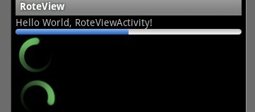
先看图
基于产品经理各种自定义需求,经过查阅了解,下面是自己对android自定义进度条的学习过程!
这个没法了只能看源码了,还好下载了源码, sources\base\core\res\res\ 下应有尽有,修改进度条颜色只能找progress ,因为是改变样式,首先找styles.xml
找到xml后,进去找到
<style name="Widget.ProgressBar">
    <item name="android:indeterminateOnly">true</item>
    <item name="android:indeterminateDrawable">@android:drawable/progress_medium_white</item>
    <item name="android:indeterminateBehavior">repeat</item>
    <item name="android:indeterminateDuration">3500</item>
    <item name="android:minWidth">48dip</item>
    <item name="android:maxWidth">48dip</item>
    <item name="android:minHeight">48dip</item>
    <item name="android:maxHeight">48dip</item>
</style>
这是默认转圈的效果style,但今天我们修改的是水平进度条颜色!
所以找到
<style name="Widget.ProgressBar.Horizontal">
    <item name="android:indeterminateOnly">false</item>
    <item name="android:progressDrawable">@android:drawable/progress_horizontal</item>
    <item name="android:indeterminateDrawable">@android:drawable/progress_indeterminate_horizontal</item>
    <item name="android:minHeight">20dip</item>
    <item name="android:maxHeight">20dip</item>
</style>
你看系统一步一步关联的,扩展性很性,低耦合,所以我们现在只要改变进度条是怎么样画出来的就行了 ,但是负责画进度条的是
<item name="android:progressDrawable"> 所以我们可以找到"drawable下的 progress_horizontal 文件,改变他就可以改变进度条颜色
<?xml version="1.0" encoding="utf-8"?>
<!-- Copyright (C) 2008 The Android Open Source Project
   Licensed under the Apache License, Version 2.0 (the "License");
   you may not use this file except in compliance with the License.
   You may obtain a copy of the License at
     http://www.apache.org/licenses/LICENSE-2.0
   Unless required by applicable law or agreed to in writing, software
   distributed under the License is distributed on an "AS IS" BASIS,
   WITHOUT WARRANTIES OR CONDITIONS OF ANY KIND, either express or implied.
   See the License for the specific language governing permissions and
   limitations under the License.
-->
<layer-list xmlns:android="http://schemas.android.com/apk/res/android">
  <item android:id="@android:id/background">
    <shape>
      <corners android:radius="5dip" />
      <gradient
          android:startColor="#ff9d9e9d"
          android:centerColor="#ff5a5d5a"
          android:centerY="0.75"
          android:endColor="#ff747674"
          android:angle="270"
      />
    </shape>
  </item>
  <item android:id="@android:id/secondaryProgress">
    <clip>
      <shape>
        <corners android:radius="5dip" />
        <gradient
            android:startColor="#80ffd300"
            android:centerColor="#80ffb600"
            android:centerY="0.75"
            android:endColor="#a0ffcb00"
            android:angle="270"
        />
      </shape>
    </clip>
  </item>
  <item android:id="@android:id/progress">
    <clip>
      <shape>
        <corners android:radius="5dip" />
        <gradient
            android:startColor="#ffffd300"
            android:centerColor="#ffffb600"
            android:centerY="0.75"
            android:endColor="#ffffcb00"
            android:angle="270"
        />
      </shape>
    </clip>
  </item>
</layer-list>
看到没有,这是系统的进度条画出的布局条件
android:startColor="#80ffd300"
android:centerColor="#80ffb600"
android:endColor="#ff747674"
我们只要改变这个色值就能改变他的颜色,主要改变的是<item android:id="@android:id/progress">下的色值就行了
说了这么多,到底怎么做呢, 很简单
1. 在我们的项目下新建一个 style.xml 文件
创建一个style 标签,集成系统默认样式,然后自定义一个新的progressDrawable 文件,随后面在layout 中的progress 中引用这个文件就行
<style name="ProgressBar_Mini" parent="@android:style/Widget.ProgressBar.Horizontal">
    <item name="android:maxHeight">50dip</item>
    <item name="android:minHeight">8dip</item>
    <item name="android:indeterminateOnly">false</item>
    <item name="android:indeterminateDrawable">@android:drawable/progress_indeterminate_horizontal</item>
    <item name="android:progressDrawable">@drawable/progressbar_mini</item>
</style>
下面是我的 progressbar_mini 文件,改变了下android:endColor="#F5F5F5" android:startColor="#BEBEBE" 的色值
<layer-list xmlns:android="http://schemas.android.com/apk/res/android" >
  <item android:id="@android:id/background">
     <shape >
        <corners android:radius="5dip" />
        <gradient
          android:angle="270"
          android:centerY="0.75"
          android:endColor="#F5F5F5"
          android:startColor="#BEBEBE" />
      </shape>
  </item>
  <item android:id="@android:id/secondaryProgress">
    <clip >
      <shape >
        <corners android:radius="0dip" />
        <gradient
          android:angle="270"
          android:centerY="0.75"
          android:endColor="#165CBC"
          android:startColor="#85B0E9" />
      </shape>
    </clip>
  </item>
  <item android:id="@android:id/progress">
    <clip >
      <shape >
        <corners android:radius="5dip" />
        <gradient
          android:angle="270"
          android:centerY="0.75"
          android:endColor="#165CBC"
          android:startColor="#85B0E9" />
      </shape>
    </clip>
  </item>
</layer-list>
最后在中引用就可以了
<ProgressBar
    android:id="@+id/progress"
    style="@style/ProgressBar_Mini"
    android:layout_width="fill_parent"
    android:layout_height="wrap_content"
    android:progress="50" />

希望本文所述对大家Android程序设计有所帮助。
- 上一篇文章: Android 开发随手笔记之使用摄像头拍照
- 下一篇文章: Android4.0平板开发之隐藏底部任务栏的方法
- Android提高之BroadcastReceiver实例详解
- Android里实现退出主程序的提示代码
- android编程之XML文件解析方法详解(附源码)
- Android中实现开机自动启动服务(service)实
- Android高仿京东垂直循环滚动新闻栏
- Android入门之Style与Theme用法实例解析
- Android编程实现修改标题栏位置使其居中的方