
- Android编程开发之TextView控件用法(2种方法)
- Android编程中selector背景选择器用法实例分析
- Android开发自学笔记(一):Hello,world!
- Android编程之绝对布局AbsoluteLayout和相对布局RelativeLayout实例详解
- Android AndBase框架实现多功能标题栏(一)
- Android使用SharedPreferences存储数据的实现方法
- android中使用Activity实现监听手指上下左右滑动
- android dialog边框去除白色边框实现思路及代码
- 详解Android中提示对话框(ProgressDialog和DatePickerDialog和TimePickerDialog&PopupWindow)
- Android布局实现圆角边框效果
- Android编程中FileOutputStream与openFileOutput()的区别分析
- Android实现多线程下载文件的方法
- Android自定义可循环的滚动选择器CycleWheelView
- Android中关于Notification及NotificationManger的详解
- Android性能优化方法
- android通过Location API显示地址信息的实现方法
- android开发教程之实现toast工具类
- Android开发之毛玻璃效果实例代码
- Android UI设计系列之自定义TextView属性实现带下划线的文本框(4)
- Android 圆角 ImageView类可设置弧度(代码简单)
- Android编程ViewPager回弹效果实例分析
- Android UI设计系列之自定义DrawView组件实现数字签名效果(5)
- Android控件之ImageView用法实例分析
- Android笔记之:在ScrollView中嵌套ListView的方法
- 仅4行代码实现Android快速文件下载
- Android利用ObjectAnimator实现ArcMenu
- Android编程中HTTP服务用法详解
- Android清空应用内部文件缓存
- Android编程之绘制文本(FontMetrics)实现方法
- Android中ListView结合CheckBox实现数据批量选择(全选、反选、全不选)
Android自定义View仿微博运动积分动画效果
自定义View一直是自己的短板,趁着公司项目不紧张的时候,多加强这方面的练习。这一系列文章主要记录自己在自定义View的学习过程中的心得与体会。
刷微博的时候,发现微博运动界面,运动积分的显示有一个很好看的动画效果。OK,就从这个开始我的自定义view之路!
看一下最后的效果图:
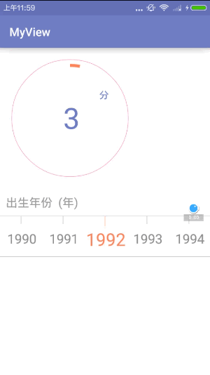
分数颜色,分数大小,外圆的颜色,圆弧的颜色都支持自己设置,整体还是和微博那个挺像的。一起看看自定义View是怎样一步一步实现的:
1.自定义view的属性:
在res/values/ 下建立一个attrs.xml , 在里面定义我们的属性以及声明我们的整个样式。
<?xml version="1.0" encoding="utf-8"?>
<resources>
 //自定义属性名,定义公共属性
 <attr name="titleSize" format="dimension"></attr>
 <attr name="titleColor" format="color"></attr>
 <attr name="outCircleColor" format="color"></attr>
 <attr name="inCircleColor" format="color"></attr>
 <attr name="lineColor" format="color"></attr>

 //自定义控件的主题样式
 <declare-styleable name="MySportView">
  <attr name="titleSize"></attr>
  <attr name="titleColor"></attr>
  <attr name="outCircleColor"></attr>
  <attr name="inCircleColor"></attr>
 </declare-styleable>
</resources>
依次定义了字体大小,字体颜色,外圆颜色,圆弧颜色4个属性,format是值该属性的取值类型。
然后就是在布局文件中申明我们的自定义view:
    <com.example.tangyangkai.myview.MySportView
    android:id="@+id/sport_view"
    android:layout_width="200dp"
    android:layout_height="200dp"
    android:layout_margin="20dp"
    app:inCircleColor="@color/strong"
    app:outCircleColor="@color/colorAccent"
    app:titleColor="@color/colorPrimary"
    app:titleSize="50dp" />
自定义view的属性我们可以自己进行设置,记得最后要引入我们的命名空间,
xmlns:app=”http://schemas.Android.com/apk/res-auto”
2.获取自定义view的属性:
/**
 * Created by tangyangkai on 16/5/23.
 */
public class MySportView extends View {


 private String text;
 private int textColor;
 private int textSize;
 private int outCircleColor;
 private int inCircleColor;
 private Paint mPaint, circlePaint;
 //绘制文本的范围
 private Rect mBound;
 private RectF circleRect;
 private float mCurrentAngle;
 private float mStartSweepValue;
 private int mCurrentPercent, mTargetPercent;

 public MySportView(Context context) {
  this(context, null);
 }

 public MySportView(Context context, AttributeSet attrs) {
  this(context, attrs, 0);
 }

 public MySportView(Context context, AttributeSet attrs, int defStyleAttr) {
  super(context, attrs, defStyleAttr);


  //获取我们自定义的样式属性
  TypedArray array = context.getTheme().obtainStyledAttributes(attrs, R.styleable.MySportView, defStyleAttr, 0);
  int n = array.getIndexCount();
  for (int i = 0; i < n; i++) {
   int attr = array.getIndex(i);
   switch (attr) {
    case R.styleable.MySportView_titleColor:
     // 默认颜色设置为黑色
     textColor = array.getColor(attr, Color.BLACK);
     break;
    case R.styleable.MySportView_titleSize:
     // 默认设置为16sp,TypeValue也可以把sp转化为px
     textSize = array.getDimensionPixelSize(attr, (int) TypedValue.applyDimension(
       TypedValue.COMPLEX_UNIT_SP, 16, getResources().getDisplayMetrics()));
     break;
    case R.styleable.MySportView_outCircleColor:
     // 默认颜色设置为黑色
     outCircleColor = array.getColor(attr, Color.BLACK);
     break;
    case R.styleable.MySportView_inCircleColor:
     // 默认颜色设置为黑色
     inCircleColor = array.getColor(attr, Color.BLACK);
     break;

   }

  }
  array.recycle();
  init();

 }

 //初始化
 private void init() {
  //创建画笔
  mPaint = new Paint();
  circlePaint = new Paint();
  //设置是否抗锯齿
  mPaint.setAntiAlias(true);
  //圆环开始角度 (-90° 为12点钟方向)
  mStartSweepValue = -90;
  //当前角度
  mCurrentAngle = 0;
  //当前百分比
  mCurrentPercent = 0;
  //绘制文本的范围
  mBound = new Rect();
 }
自定义View一般需要实现一下三个构造方法,这三个构造方法是一层调用一层的,属于递进关系。因此,我们只需要在最后一个构造方法中来获得View的属性了。
第一步:通过theme.obtainStyledAttributes()方法获得自定义控件的主题样式数组;
第二步:遍历每个属性来获得对应属性的值,也就是我们在xml布局文件中写的属性值;
第三步:在循环结束之后记得调用array.recycle()来回收资源;第四步就是进行一下必要的初始化,不建议在onDraw的过程中去实例化对象,因为这是一个频繁重复执行的过程,new是需要分配内存空间的,如果在一个频繁重复的过程中去大量地new对象会造成内存浪费的情况。
3.重写onMesure方法确定view大小:
当你没有重写onMeasure方法时候,系统调用默认的onMeasure方法:
 @Override
 protected void onMeasure(int widthMeasureSpec, int heightMeasureSpec) {
  super.onMeasure(widthMeasureSpec, heightMeasureSpec);
 }
这个方法的作用是:测量控件的大小。其实Android系统在加载布局的时候是由系统测量各子View的大小来告诉父View我需要占多大空间,然后父View会根据自己的大小来决定分配多大空间给子View。MeasureSpec的specMode模式一共有三种:
MeasureSpec.EXACTLY:父视图希望子视图的大小是specSize中指定的大小;一般是设置了明确的值或者是MATCH_PARENT
MeasureSpec.AT_MOST:子视图的大小最多是specSize中的大小;表示子布局限制在一个最大值内,一般为WARP_CONTENT
MeasureSpec.UNSPECIFIED:父视图不对子视图施加任何限制,子视图可以得到任意想要的大小;表示子布局想要多大就多大,很少使用。
想要”wrap_content”的效果怎么办?不着急,只有重写onMeasure方法:
 @Override
 protected void onMeasure(int widthMeasureSpec, int heightMeasureSpec) {
//如果布局里面设置的是固定值,这里取布局里面的固定值和父布局大小值中的最小值;如果设置的是match_parent,则取父布局的大小
  int widthMode = MeasureSpec.getMode(widthMeasureSpec);
  int widthSize = MeasureSpec.getSize(widthMeasureSpec);
  int heightMode = MeasureSpec.getMode(heightMeasureSpec);
  int heightSize = MeasureSpec.getSize(heightMeasureSpec);
  int width;
  int height;
  if (widthMode == MeasureSpec.EXACTLY) {
   width = widthSize;
  } else {
   mPaint.setTextSize(textSize);
   mPaint.getTextBounds(text, 0, text.length(), mBound);
   float textWidth = mBound.width();
   int desired = (int) (getPaddingLeft() + textWidth + getPaddingRight());
   width = desired;
  }

  if (heightMode == MeasureSpec.EXACTLY) {
   height = heightSize;
  } else {
   mPaint.setTextSize(textSize);
   mPaint.getTextBounds(text, 0, text.length(), mBound);
   float textHeight = mBound.height();
   int desired = (int) (getPaddingTop() + textHeight + getPaddingBottom());
   height = desired;
  }
  //调用父类方法,把View的大小告诉父布局。
  setMeasuredDimension(width, height);
 }
4.重写onDraw方法进行绘画:
 @Override
 protected void onDraw(Canvas canvas) {
  //设置外圆的颜色
  mPaint.setColor(outCircleColor);
  //设置外圆为空心
  mPaint.setStyle(Paint.Style.STROKE);
  //画外圆
  canvas.drawCircle(getWidth() / 2, getWidth() / 2, getWidth() / 2, mPaint);
  //设置字体颜色
  mPaint.setColor(textColor);
  //设置字体大小
  mPaint.setTextSize(textSize);
  //得到字体的宽高范围
  text = String.valueOf(mCurrentPercent);
  mPaint.getTextBounds(text, 0, text.length(), mBound);
  //绘制字体
  canvas.drawText(text, getWidth() / 2 - mBound.width() / 2, getWidth() / 2 + mBound.height() / 2, mPaint);

  //设置字体大小
  mPaint.setTextSize(textSize / 3);
  //绘制字体
  canvas.drawText("分", getWidth() * 3 / 4, getWidth() / 3, mPaint);

  circlePaint.setAntiAlias(true);
  circlePaint.setStyle(Paint.Style.STROKE);
  //设置圆弧的宽度
  circlePaint.setStrokeWidth(10);
  //设置圆弧的颜色
  circlePaint.setColor(inCircleColor);
  //圆弧范围
  circleRect = new RectF(20, 20, getWidth() - 20, getWidth() - 20);
  //绘制圆弧
  canvas.drawArc(circleRect, mStartSweepValue, mCurrentAngle, false, circlePaint);
  //判断当前百分比是否小于设置目标的百分比
  if (mCurrentPercent < mTargetPercent) {
   //当前百分比+1
   mCurrentPercent += 1;
   //当前角度+360
   mCurrentAngle += 3.6;
   //每100ms重画一次
   postInvalidateDelayed(100);
  }
 }
代码注释写的灰常详细,这里和大家分享一个小技巧,就是在重写onDraw方法的之前,自己在本子上画一遍,坐标,位置等简单标注一下。真的很实用!!!
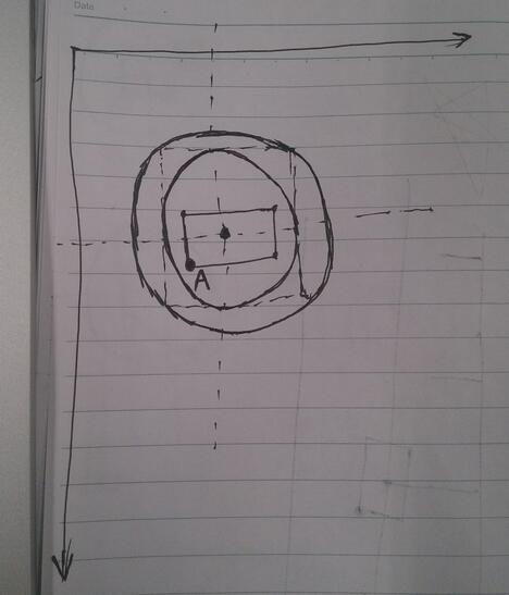
(1)绘制文本的时候,传入的第二个参数与第三个参数也就是图中A点的位置
复制代码 代码如下:canvas.drawText(text, getWidth() / 2 - mBound.width() / 2, getWidth() / 2 + mBound.height() / 2, mPaint);
(2)绘制圆弧先确定圆弧的范围,传入的四个参数就是图中内圆的外接正方形的坐标
复制代码 代码如下: circleRect = new RectF(20, 20, getWidth() - 20, getWidth() - 20);
(3)绘制圆弧,参数依次是圆弧范围;开始的角度;圆弧的角度;第四个为True时,在绘制圆弧时将圆心包括在内,通常用来绘制扇形,我们选false;圆弧画笔复制代码 代码如下:canvas.drawArc(circleRect, mStartSweepValue, mCurrentAngle, false, circlePaint);
最后就是分数增加与圆弧动画的实现,这时就需要调用postInvalidateDelayed这个方法,这个方法会每隔指定的时间来调用View的invalidate()方法,最终会重新调用onDraw方法,完成一个周期。所以如果想控制动画,我们就可以定义一个全局的mCurrentPercent与mCurrentAngle变量,在onDraw方法中不断的递增,达到动画的效果。
OK,到这里自定义view的实现就全部结束了,其实重头梳理一遍,也没有那么恐怖。
下一篇自定义View,不见不散!
以上就是本文的全部内容,希望对大家的学习有所帮助,也希望大家多多支持脚本之家。
- 上一篇文章: Android自定义View实现广告信息上下滚动效果
- 下一篇文章: 如何判断软件程序是否联网 联网状态提示信息Android实现
- 在Android 模拟器上安装和卸载APK包的方法
- Android中让图片自适应控件的大小的方法
- android 多线程技术应用
- android 如何设置开机后屏幕亮度默认值为自
- Android4.2中全屏或者取消标题栏的方法总结
- Android三种网络通讯方式及Android的网络通
- ReactiveCocoa代码实践之-RAC网络请求重构