
- Android中主要资源文件及文件夹介绍
- Android编程实现识别与挂载U盘的方法
- 几个Android编程时需要注意的 web 问题
- android实现程序自动升级到安装示例分享(下载android程序安装包)
- Android中给fragment写入参数的轻量开发包FragmentArgs简介
- 三种Android单击事件onclick的实现方法
- Android 5.1系统默认图标机器人变半身像
- Android拍照保存在系统相册不显示的问题解决方法
- Android编程之SurfaceView实例详解
- Android 将 android view 的位置设为右下角的解决方法
- unity3d发布apk在android虚拟机中运行的详细步骤(unity3d导出android apk)
- 解决Android SurfaceView绘制触摸轨迹闪烁问题的方法
- Android ScrollView使用代码示例
- android自定义按钮示例(重写imagebutton控件实现图片按钮)
- android应用开发之spinner控件的简单使用
- Android页面之间进行数据回传的方法分析
- android 自定义ScrollView实现背景图片伸缩的实现代码及思路
- android中intent传递list或者对象的方法
- Android学习项目之简易版微信为例(二)
- android 上传文件到服务器代码实例
- Listview的异步加载性能优化
- android listview优化几种写法详细介绍
- Android的异步任务AsyncTask详解
- Android4.4下MediaProvider无法向外置SD卡中文件写数据的解决方法
- Android短信验证码自动填充功能
- Android从服务器获取图片的实例方法
- Android Studio的中文乱码问题解决方法
- Android实现中文按拼音排序方法
- android byte[] 和short[]转换的方法代码
- 解析Android 如何获得已安装应用大小
Android中shape定义控件的使用
Android中常常使用shape来定义控件的一些显示属性,今天看了一些shape的使用,对shape有了大体的了解,稍作总结:
先看下面的代码:
<shape>
<!-- 实心 -->
<solid android:color="#ff9d77"/>
<!-- 渐变 -->
<gradient
android:startColor="#ff8c00"
android:endColor="#FFFFFF"
android:angle="270" />
<!-- 描边 -->
<stroke
android:width="2dp"
android:color="#dcdcdc" />
<!-- 圆角 -->
<corners
android:radius="2dp" />
<padding
android:left="10dp"
android:top="10dp"
android:right="10dp"
android:bottom="10dp" />
</shape>
solid:实心,就是填充的意思
android:color指定填充的颜色
gradient:渐变
android:startColor和android:endColor分别为起始和结束颜色,ndroid:angle是渐变角度,必须为45的整数倍。
另外渐变默认的模式为android:type="linear",即线性渐变,可以指定渐变为径向渐变,android:type="radial",径向渐变需要指定半径android:gradientRadius="50"。
stroke:描边
android:width="2dp" 描边的宽度,android:color 描边的颜色。
我们还可以把描边弄成虚线的形式,设置方式为:
android:dashWidth="5dp"
android:dashGap="3dp"
其中android:dashWidth表示'-'这样一个横线的宽度,android:dashGap表示之间隔开的距离。
corners:圆角
android:radius为角的弧度,值越大角越圆。
我们还可以把四个角设定成不同的角度,方法为:
<corners
android:topRightRadius="20dp" 右上角
android:bottomLeftRadius="20dp" 左下角
android:topLeftRadius="1dp" 左上角
android:bottomRightRadius="0dp" 右下角
/>
这里有个地方需要注意,bottomLeftRadius是右下角,而不是左下角,这个有点郁闷,不过不影响使用,记得别搞错了就行。
还有网上看到有人说设置成0dp无效,不过我在测试中发现是可以的,我用的是2.2,可能修复了这个问题吧,如果无效的话那就只能设成1dp了。
padding:间隔
这个就不用多说了,XML布局文件中经常用到。
大体的就是这样,以下是一个使用的具体示例:用在Selector中作为Button的背景,分别定义了按钮的一般状态、获得焦点状态和按下时的状态,具体代码如下:
main.xml:
<Button
android:layout_width="wrap_content"
android:layout_height="wrap_content"
android:text="TestShapeButton"
android:background="@drawable/button_selector"
/>
button_selector.xml:
<?xml version="1.0" encoding="utf-8"?>
<selector
xmlns:android="http://schemas.android.com/apk/res/android">
<item android:state_pressed="true" >
<shape>
<!-- 渐变 -->
<gradient
android:startColor="#ff8c00"
android:endColor="#FFFFFF"
android:type="radial"
android:gradientRadius="50" />
<!-- 描边 -->
<stroke
android:width="2dp"
android:color="#dcdcdc"
android:dashWidth="5dp"
android:dashGap="3dp" />
<!-- 圆角 -->
<corners
android:radius="2dp" />
<padding
android:left="10dp"
android:top="10dp"
android:right="10dp"
android:bottom="10dp" />
</shape>
</item>
<item android:state_focused="true" >
<shape>
<gradient
android:startColor="#ffc2b7"
android:endColor="#ffc2b7"
android:angle="270" />
<stroke
android:width="2dp"
android:color="#dcdcdc" />
<corners
android:radius="2dp" />
<padding
android:left="10dp"
android:top="10dp"
android:right="10dp"
android:bottom="10dp" />
</shape>
</item>
<item>
<shape>
<solid android:color="#ff9d77"/>
<stroke
android:width="2dp"
android:color="#fad3cf" />
<corners
android:topRightRadius="5dp"
android:bottomLeftRadius="5dp"
android:topLeftRadius="0dp"
android:bottomRightRadius="0dp"
/>
<padding
android:left="10dp"
android:top="10dp"
android:right="10dp"
android:bottom="10dp" />
</shape>
</item>
</selector>
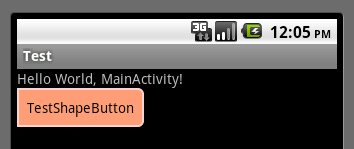
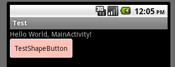
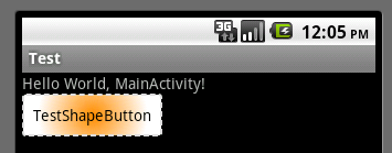
运行效果如下图:
一般状态:
获得焦点状态:
按下状态:
以上所述是小编给大家分享的Android中shape定义控件的使用,希望大家喜欢。
- 上一篇文章: Android编程获取控件宽和高的方法总结分析
- 下一篇文章: Android数据存储之SQLite使用