
- android编程实现系统图片剪裁的方法
- Android RecyclerView滑动删除和拖动排序
- Android Webview添加网页加载进度条实例详解
- Android中获取手机屏幕大小的方法
- 完美解决EditText和ScrollView的滚动冲突(下)
- 用Android MenuInflater创建菜单项的方法步骤
- php 异步调用方法实现示例
- Android中自定义进度条详解
- Android SlidingDrawer 抽屉效果的实现
- Android模拟器对应的电脑快捷键说明
- Android中使用DownloadManager类来管理数据下载的教程
- android自由改变Dialog窗口位置的方法
- Android仿腾讯QQ实现滑动删除 附源码下载
- Android编程实现QQ表情的发送和接收完整实例(附源码)
- 基于Android今日事今日毕的使用介绍
- android 微信 sdk api调用不成功解决方案
- 使用RecyclerView添加Header和Footer的方法
- Android实现创建或升级数据库时执行语句
- Android使用criteria选择合适的地理位置服务实现方法
- Android开发笔记之Android中数据的存储方式(二)
- Android HttpURLConnection.getResponseCode()错误解决方法
- android中webview控件和javascript交互实例
- 分享Android微信红包插件
- Android编程之OpenGL绘图技巧总结
- Android实现TextView中文字链接的4种方式介绍及代码
- Android复选框对话框用法实例简析
- RecyclerView的万能分割线
- Android实现图片轮播切换实例代码
- 实例解析Android系统中的ContentProvider组件用法
- Android客户端软件开发_3、软件的概述
android基本控件ToggleButton&Switch使用指南
作者:佚名 Android开发编辑:admin 更新时间:2022-07-23
ToggleButton(开关按钮)和Switch(开关)讲解:
一、核心属性讲解:
(1)ToggleButton
textOn:按钮被选中的时候文字显示
textOff:按钮没有被选中的时候文字显示
ToggleButton的状态只能是选中和未选中,并且需要为不同的状态设置不同的显示文本。
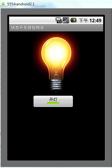
以下案例为ToggleButton的用法
目录结构

main.xml布局文件
<?xml version="1.0" encoding="utf-8"?>
<LinearLayout xmlns:android="http://schemas.android.com/apk/res/android"
  android:orientation="vertical"
  android:layout_width="fill_parent"
  android:layout_height="fill_parent">
  <ImageView android:id="@+id/imageView"
    android:layout_width="wrap_content"
    android:layout_height="wrap_content"
    android:src="@drawable/bulb_off"
    android:layout_gravity="center_horizontal" />
  <ToggleButton android:id="@+id/toggleButton"
    android:layout_width="140dip"
    android:layout_height="wrap_content"
    android:textOn="开灯"
    android:textOff="关灯"
    android:layout_gravity="center_horizontal" />
</LinearLayout>
ToggleButtonActivity类
package com.ljq.tb;

import android.app.Activity;
import android.os.Bundle;
import android.widget.CompoundButton;
import android.widget.ImageView;
import android.widget.ToggleButton;
import android.widget.CompoundButton.OnCheckedChangeListener;

public class ToggleButtonActivity extends Activity {
  private ImageView imageView=null;
  private ToggleButton toggleButton=null;

  @Override
  public void onCreate(Bundle savedInstanceState) {
    super.onCreate(savedInstanceState);
    setContentView(R.layout.main);

    imageView=(ImageView) findViewById(R.id.imageView);
    toggleButton=(ToggleButton)findViewById(R.id.toggleButton);
    toggleButton.setOnCheckedChangeListener(new OnCheckedChangeListener(){

      public void onCheckedChanged(CompoundButton buttonView,
          boolean isChecked) {
        toggleButton.setChecked(isChecked);
        imageView.setImageResource(isChecked?R.drawable.bulb_on:R.drawable.bulb_off);
      }

    });
  }
}
运行效果:
(2)switch:
showText:设置textOn/off的时候文字是否显示
android:showText:设置on/off的时候是否显示文字,boolean
android:splitTrack:是否设置一个间隙,让滑块与底部图片分隔,boolean
android:switchMinWidth:设置开关的最小宽度
android:switchPadding:设置滑块内文字的间隔
android:textOff:按钮没有被选中时显示的文字
android:textOn:按钮被选中时显示的文字
android:textStyle:文字风格,粗体,斜体写划线那些
android:track:底部的图片
android:thumb:滑块的图片
可以自己动手试一试每一个属性
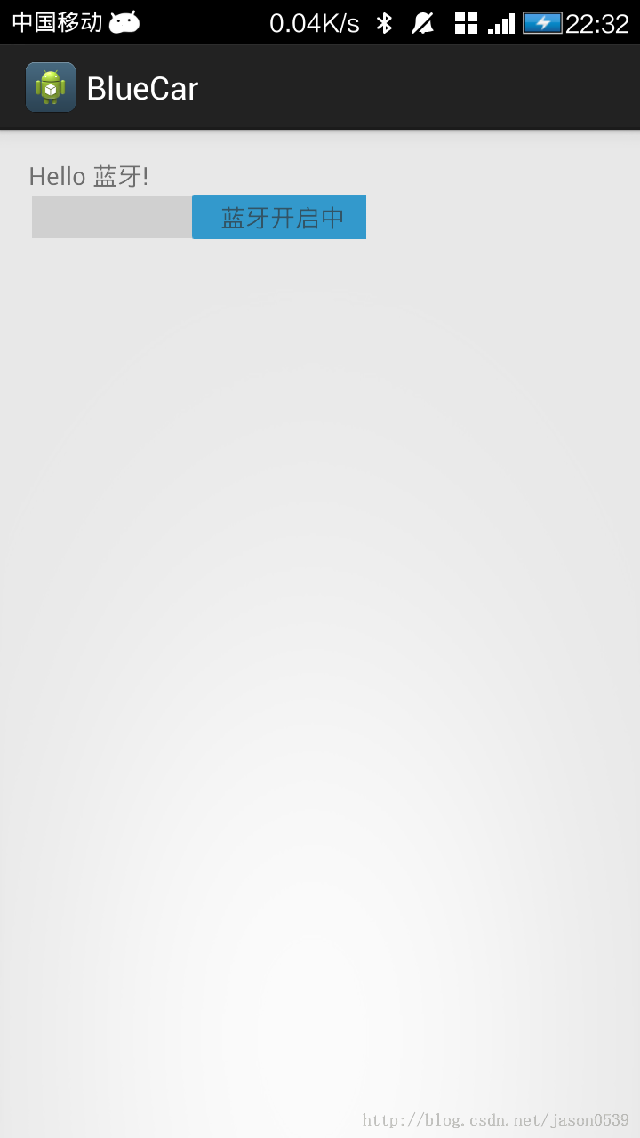
在做一个蓝牙开关时候,用到了switch,记一下用法,其实跟Button是几乎一样的.
布局中:
<Switch
    android:id="@+id/open"
    android:layout_width="wrap_content"
    android:layout_height="wrap_content"
    android:textOff="蓝牙关闭中"
    android:textOn="蓝牙开启中" />
java代码中
open.setOnCheckedChangeListener(new OnCheckedChangeListener() {

      @Override
      public void onCheckedChanged(CompoundButton buttonView,
          boolean isChecked) {
        // TODO Auto-generated method stub
        if (isChecked) {
          mBluetoothAdapter.enable();//打开蓝牙
        } else {
          mBluetoothAdapter.disable();// 关闭蓝牙
        }
      }
    });
就是这样了,一看就明白了.
- 上一篇文章: Android编程中@id和@+id的区别分析
- 下一篇文章: Android简单实现圆盘抽奖界面
- Android开发中常用的一些小技巧
- Android实现沉浸式导航栏实例代码
- Android 管理Activity中的fragments
- Android AutoCompleteTextView控件使用实例
- 解决Android SurfaceView绘制触摸轨迹闪烁问
- Android手机获取IP地址的两种方法
- Android基础知识之单点触摸