
- android中Bitmap的放大和缩小实例代码
- 详解Android的OkHttp包编写异步HTTP请求调用的方法
- Android提高之BLE开发Android手机搜索iBeacon基站
- Android中AutoCompleteTextView与TextWatcher结合小实例
- Android三种GSM手机定位技术分析
- Android获取当前已连接的wifi信号强度的方法
- Android实现隐藏状态栏和标题栏
- ReactiveCocoa代码实践之-UI组件的RAC信号操作
- Android4.2中全屏或者取消标题栏的方法总结
- android将搜索引擎设置为中国雅虎无法搜索问题解决方法
- Android画图并保存图片的具体实现代码
- Android的多媒体管理库Glide的基本使用示例
- android中ListView数据刷新时的同步方法
- Android左右滑出菜单实例分析
- Android自定义View过程解析
- Android实现取消GridView中Item选中时默认的背景色
- Android布局之LinearLayout自定义高亮背景的方法
- Android ActionBar使用教程
- Android 使用ViewPager自动滚动循环轮播效果
- Android TextView 设置字体大小的方法
- 探讨:如何修改Android超时休眠时间
- Android实现记住用户名和密码功能
- Android开发之完成登陆界面的数据保存回显操作实例
- Android编程实现读取手机联系人、拨号、发送短信及长按菜单操作方法实例小结
- Android广播接实现监听电话状态(电话的状态,拦截)
- Android监听电池状态实例代码
- Android自定义控件之自定义组合控件(三)
- Android下使用TCPDUMP实现数据抓包教程
- Android 网络状态实时监听代码实例(一)
- Android View如何测量
Android自定义格式显示Button的布局思路
先把来源贴上
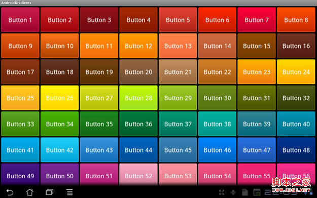
http://zrgiu.com/blog/2011/01/making-your-android-app-look-better/
http://www.dibbus.com/2011/02/gradient-buttons-for-android/http://www.dibbus.com/2011/08/even-more-gradient-buttons-for-android/
然后再让大家看看效果,这些都是xml布局文件实现的,一张图片都未曾使用。
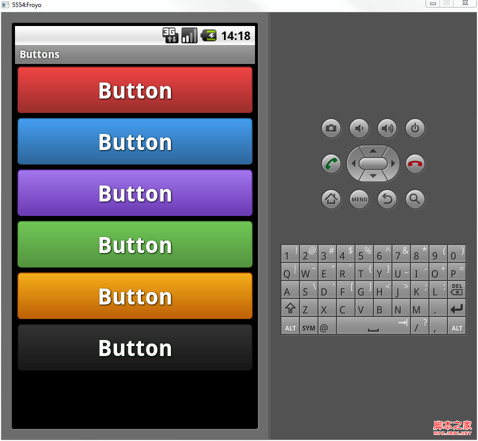
顺便贴出几个布局文件给大家看看:
复制代码 代码如下:
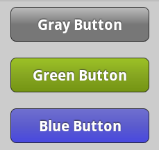
<?xml version="1.0" encoding="utf-8"?>
<selector xmlns:android="http://schemas.android.com/apk/res/android">
<item android:state_pressed="true" >
<shape>
<solid
android:color="#449def" />
<stroke
android:width="1dp"
android:color="#2f6699" />
<corners
android:radius="3dp" />
<padding
android:left="10dp"
android:top="10dp"
android:right="10dp"
android:bottom="10dp" />
</shape>
</item>
<item>
<shape>
<gradient
android:startColor="#449def"
android:endColor="#2f6699"
android:angle="270" />
<stroke
android:width="1dp"
android:color="#2f6699" />
<corners
android:radius="4dp" />
<padding
android:left="10dp"
android:top="10dp"
android:right="10dp"
android:bottom="10dp" />
</shape>
</item>
</selector>
复制代码 代码如下:
<?xml version=”1.0″ encoding=”UTF-8″?>
<shape xmlns:android=”http://schemas.android.com/apk/res/android”>
<solid android:color=”#F000″/>
<stroke android:width=”1px” android:color=”#BB000000″ />
<padding
android:left=”10dp”
android:top=”7dp”
android:right=”10dp”
android:bottom=”7dp”
/>
<corners
android:bottomRightRadius=”5dp”
android:bottomLeftRadius=”5dp”
android:topLeftRadius=”5dp”
android:topRightRadius=”5dp”
/>
<gradient
android:angle=”90″
android:startColor=”#4747e0″
android:centerColor=”#5b5bcd”
android:endColor=”#6f6fcf”
android:type=”linear”
/>
</shape>
这里有个工程,开源的
http://code.google.com/p/android-gradients-sample/downloads/list
顺便把这两个网页给收了,说不定以后能够提供灵感或者参考
http://www.webdesignshock.com/css-button
http://www.jb51.net/css/23418.html
- 上一篇文章: android 仿微信聊天气泡效果实现思路
- 下一篇文章: Android TextView和ImageView简单说明
- android 键盘事件和屏幕事件的运行原理及交
- 安卓(Android)开发之自定义饼状图
- Android实战打飞机游戏之实现主角以及主角相
- Android组件Glide实现图片平滑滚动效果
- android 添加随意拖动的桌面悬浮窗口
- Android动画之渐变动画(Tween Animation)详
- Android自定义Adapter的ListView的思路及代