
- Android SD卡上文件操作及记录日志操作实例分析
- Android中Matrix用法实例分析
- Android开发笔记之:如何安全中止一个自定义线程Thread的方法
- android通过蓝牙接收文件打开时无法自动选择合适的应用程序
- 使用adb命令向Android模拟器中导入通讯录联系人的方法
- Android中AsyncTask与handler用法实例分析
- Android TCP 文件客户端与服务器DEMO介绍
- android计算pad或手机的分辨率/像素/密度/屏幕尺寸/DPI值的方法
- Android 自定义SurfaceView详解
- 怎样删除android的gallery中的图片实例说明
- Android WebView使用的技巧与一些坑
- 刷新Activity中的scrollview示例(局部ui刷新)
- Android布局案例之人人android九宫格
- Android高级开发之性能优化典范
- Android动态添加设置布局与控件的方法
- Android实现带附件的邮件发送功能
- Android中阻止AlertDialog关闭实例代码
- Android xUtils更新到3.0后的基本使用规则详解
- Android编程之文件的读写实例详解
- Android开发改变字体颜色方法
- Android判断屏幕是横屏或是竖屏的简单实现方法
- Android 5.0正式推送 并提供系统镜像下载
- Android使用WebView播放flash的方法
- Android中打电话的数据流程分析
- android 版本检测 Android程序的版本检测与更新实现介绍
- 基于Android SDK-在64位Linux中使用需要注意的问题
- Android NDK 生成以及调用so 文件
- 解析Android应用启动后自动创建桌面快捷方式的实现方法
- Android 获取正在运行的任务和服务的小例子
- Android开发中LayoutInflater用法详解
Android自定义控件之自定义组合控件(三)
前言:
前两篇介绍了自定义控件的基础原理Android自定义控件基本原理详解(一)、Android自定义控件之自定义属性(二)。今天重点介绍一下如何通过自定义组合控件来提高布局的复用,降低开发成本,以及维护成本。
使用自定义组合控件的好处?
我们在项目开发中经常会遇见很多相似或者相同的布局,比如APP的标题栏,我们从三种方式实现标题栏来对比自定义组件带来的好处,毕竟好的东西还是以提高开发效率,降低开发成本为导向的。
1.)第一种方式:直接在每个xml布局中写相同的标题栏布局代码
<?xml version="1.0" encoding="utf-8"?>
<LinearLayout xmlns:android="http://schemas.android.com/apk/res/android"
 xmlns:lee="http://schemas.android.com/apk/res-auto"
 android:layout_width="match_parent"
 android:layout_height="match_parent"
 android:orientation="vertical">

 <RelativeLayout
  android:layout_width="match_parent"
  android:background="@color/green"
  android:layout_height="45dp">

  <Button
   android:id="@+id/title_bar_left"
   android:layout_width="wrap_content"
   android:layout_height="wrap_content"
   android:layout_alignParentLeft="true"
   android:layout_centerVertical="true"
   android:layout_marginLeft="5dp"
   android:background="@mipmap/titlebar_back_icon"
   android:minHeight="45dp"
   android:minWidth="45dp"
   android:textSize="14sp" />

  <TextView
   android:id="@+id/title_bar_title"
   android:layout_width="wrap_content"
   android:layout_height="wrap_content"
   android:layout_centerInParent="true"
   android:text="登录"
   android:singleLine="true"
   android:textSize="17sp" />

  <Button
   android:id="@+id/title_bar_right"
   android:layout_width="wrap_content"
   android:layout_height="wrap_content"
   android:layout_alignParentRight="true"
   android:layout_centerVertical="true"
   android:layout_marginRight="7dp"
   android:text="提交"
   android:textColor="@android:color/white"
   android:background="@null"
   android:minHeight="45dp"
   android:minWidth="45dp"
   android:textSize="14sp" />
 </RelativeLayout>

</LinearLayout>
这种方式没有任何布局复用的概念,同时也让当前的布局变得臃肿难以维护,开发效率低下,而且这个还需要要求每个开发人员必须细心否则有可能会做出参差不齐的标题栏,所以这种方式是最不推荐使用的。
2.)第二种方式:使用include标签
首先定义标题栏布局
 <RelativeLayout
  android:layout_width="match_parent"
  android:background="@color/green"
  android:layout_height="45dp">

  <Button
   android:id="@+id/title_bar_left"
   android:layout_width="wrap_content"
   android:layout_height="wrap_content"
   android:layout_alignParentLeft="true"
   android:layout_centerVertical="true"
   android:layout_marginLeft="5dp"
   android:minHeight="45dp"
   android:minWidth="45dp"
   android:textSize="14sp" />

  <TextView
   android:id="@+id/title_bar_title"
   android:layout_width="wrap_content"
   android:layout_height="wrap_content"
   android:layout_centerInParent="true"
   android:singleLine="true"
   android:textSize="17sp" />

  <Button
   android:id="@+id/title_bar_right"
   android:layout_width="wrap_content"
   android:layout_height="wrap_content"
   android:layout_alignParentRight="true"
   android:layout_centerVertical="true"
   android:layout_marginRight="7dp"
   android:background="@null"
   android:minHeight="45dp"
   android:minWidth="45dp"
   android:textSize="14sp" />
 </RelativeLayout>
然后在需要的地方通过include标签实现引用
<LinearLayout xmlns:android="http://schemas.android.com/apk/res/android"
 xmlns:lee="http://schemas.android.com/apk/res-auto"
 android:layout_width="match_parent"
 android:layout_height="match_parent"
 android:orientation="vertical">

 <include layout="@layout/view_title_bar" />

</LinearLayout>
通过上面的布局代码,我们可以使用上面这种方式确实实现了布局的复用,而且也避免了开发人员开发出参差不齐标题栏的问题,但是同时也引入了新的问题,比如更加降低了开发效率,加大了开发成本,问题就在我们该如何为每个布局文件定义标题栏?只有通过代码的方式来设置标题问题,左右按钮等其他的属性,导致布局属性和Activity代码耦合性比较高,所以这种方式也不是推荐的方式。
3.)第三种方式:通过自定义组合控件
这里先不具体介绍如何实现一个自定义组合控件,这里先介绍一下自定义组合控件带来的好处。
•提高布局文件开发效率
•降低布局文件维护成本
•降低布局文件和Activity代码耦合性
•容易扩展
•简单易用
如何实现一个自定义组合控件
1.)先定义一个布局文件
<merge xmlns:android="http://schemas.android.com/apk/res/android">

 <Button
  android:id="@+id/title_bar_left"
  android:layout_width="wrap_content"
  android:layout_height="wrap_content"
  android:layout_alignParentLeft="true"
  android:layout_centerVertical="true"
  android:layout_marginLeft="5dp"
  android:background="@null"
  android:minHeight="45dp"
  android:minWidth="45dp"
  android:textSize="14sp" />

 <TextView
  android:id="@+id/title_bar_title"
  android:layout_width="wrap_content"
  android:layout_height="wrap_content"
  android:layout_centerInParent="true"
  android:singleLine="true"
  android:textSize="17sp" />

 <Button
  android:id="@+id/title_bar_right"
  android:layout_width="wrap_content"
  android:layout_height="wrap_content"
  android:layout_alignParentRight="true"
  android:layout_centerVertical="true"
  android:layout_marginRight="7dp"
  android:background="@null"
  android:minHeight="45dp"
  android:minWidth="45dp"
  android:textSize="14sp" />

</merge>
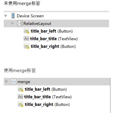
注意:这里为何要使用merge标签,自定义组合控件时会继承RelativeLayout、LinearLayout等控件,这样导致布局的层级无形中增加了一层,如下是对比:
2.)定义自定义属性
比如标题文字、标题栏左边按钮图标等。
 <declare-styleable name="CustomTitleBar">
  <attr name="title_background_color" format="reference|integer" />
  <attr name="left_button_visible" format="boolean" />
  <attr name="right_button_visible" format="boolean" />
  <attr name="title_text" format="string" />
  <attr name="title_text_color" format="color" />
  <attr name="title_text_drawable" format="reference|integer" />
  <attr name="right_button_text" format="string" />
  <attr name="right_button_text_color" format="color" />
  <attr name="right_button_drawable" format="reference|integer" />
  <attr name="left_button_text" format="string" />
  <attr name="left_button_text_color" format="color" />
  <attr name="left_button_drawable" format="reference|integer" />
 </declare-styleable>
3.)自定义一个View根据需求继承不同的ViewGroup子类,比如:RelativeLayout、LinearLayout等,我们这里继承RelativeLayout。
public class CustomTitleBar extends RelativeLayout {
 private Button titleBarLeftBtn;
 private Button titleBarRightBtn;
 private TextView titleBarTitle;

 public CustomTitleBar(Context context, AttributeSet attrs) {
  super(context, attrs);
  LayoutInflater.from(context).inflate(R.layout.custom_title_bar, this, true);
  titleBarLeftBtn = (Button) findViewById(R.id.title_bar_left);
  titleBarRightBtn = (Button) findViewById(R.id.title_bar_right);
  titleBarTitle = (TextView) findViewById(R.id.title_bar_title);

  TypedArray attributes = context.obtainStyledAttributes(attrs, R.styleable.CustomTitleBar);
  if (attributes != null) {
   //处理titleBar背景色
   int titleBarBackGround = attributes.getResourceId(R.styleable.CustomTitleBar_title_background_color, Color.GREEN);
   setBackgroundResource(titleBarBackGround);
   //先处理左边按钮
   //获取是否要显示左边按钮
   boolean leftButtonVisible = attributes.getBoolean(R.styleable.CustomTitleBar_left_button_visible, true);
   if (leftButtonVisible) {
    titleBarLeftBtn.setVisibility(View.VISIBLE);
   } else {
    titleBarLeftBtn.setVisibility(View.INVISIBLE);
   }
   //设置左边按钮的文字
   String leftButtonText = attributes.getString(R.styleable.CustomTitleBar_left_button_text);
   if (!TextUtils.isEmpty(leftButtonText)) {
    titleBarLeftBtn.setText(leftButtonText);
    //设置左边按钮文字颜色
    int leftButtonTextColor = attributes.getColor(R.styleable.CustomTitleBar_left_button_text_color, Color.WHITE);
    titleBarLeftBtn.setTextColor(leftButtonTextColor);
   } else {
    //设置左边图片icon 这里是二选一 要么只能是文字 要么只能是图片
    int leftButtonDrawable = attributes.getResourceId(R.styleable.CustomTitleBar_left_button_drawable, R.mipmap.titlebar_back_icon);
    if (leftButtonDrawable != -1) {
     titleBarLeftBtn.setBackgroundResource(leftButtonDrawable);
    }
   }

   //处理标题
   //先获取标题是否要显示图片icon
   int titleTextDrawable = attributes.getResourceId(R.styleable.CustomTitleBar_title_text_drawable, -1);
   if (titleTextDrawable != -1) {
    titleBarTitle.setBackgroundResource(titleTextDrawable);
   } else {
    //如果不是图片标题 则获取文字标题
    String titleText = attributes.getString(R.styleable.CustomTitleBar_title_text);
    if (!TextUtils.isEmpty(titleText)) {
     titleBarTitle.setText(titleText);
    }
    //获取标题显示颜色
    int titleTextColor = attributes.getColor(R.styleable.CustomTitleBar_title_text_color, Color.WHITE);
    titleBarTitle.setTextColor(titleTextColor);
   }

   //先处理右边按钮
   //获取是否要显示右边按钮
   boolean rightButtonVisible = attributes.getBoolean(R.styleable.CustomTitleBar_right_button_visible, true);
   if (rightButtonVisible) {
    titleBarRightBtn.setVisibility(View.VISIBLE);
   } else {
    titleBarRightBtn.setVisibility(View.INVISIBLE);
   }
   //设置右边按钮的文字
   String rightButtonText = attributes.getString(R.styleable.CustomTitleBar_right_button_text);
   if (!TextUtils.isEmpty(rightButtonText)) {
    titleBarRightBtn.setText(rightButtonText);
    //设置右边按钮文字颜色
    int rightButtonTextColor = attributes.getColor(R.styleable.CustomTitleBar_right_button_text_color, Color.WHITE);
    titleBarRightBtn.setTextColor(rightButtonTextColor);
   } else {
    //设置右边图片icon 这里是二选一 要么只能是文字 要么只能是图片
    int rightButtonDrawable = attributes.getResourceId(R.styleable.CustomTitleBar_right_button_drawable, -1);
    if (rightButtonDrawable != -1) {
     titleBarRightBtn.setBackgroundResource(rightButtonDrawable);
    }
   }
   attributes.recycle();
  }
 }

 public void setTitleClickListener(OnClickListener onClickListener) {
  if (onClickListener != null) {
   titleBarLeftBtn.setOnClickListener(onClickListener);
   titleBarRightBtn.setOnClickListener(onClickListener);
  }
 }

 public Button getTitleBarLeftBtn() {
  return titleBarLeftBtn;
 }

 public Button getTitleBarRightBtn() {
  return titleBarRightBtn;
 }

 public TextView getTitleBarTitle() {
  return titleBarTitle;
 }
}
4.)在不同的XML布局中引用
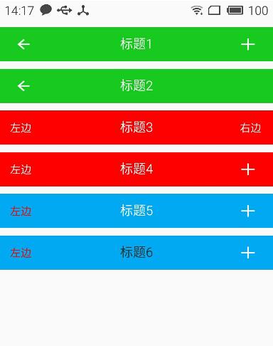
关于如何使用自定义属性这里就不再说明了,为了更加直观的查看效果,我这里在一个布局文件中实现不同要求的标题栏
<?xml version="1.0" encoding="utf-8"?>
<LinearLayout xmlns:android="http://schemas.android.com/apk/res/android"
 xmlns:lee="http://schemas.android.com/apk/res-auto"
 android:layout_width="match_parent"
 android:layout_height="match_parent"
 android:orientation="vertical">

 <com.whoislcj.views.CustomTitleBar
  android:layout_width="match_parent"
  android:layout_height="45dp"
  android:layout_marginTop="10dp"
  lee:right_button_drawable="@mipmap/titlebar_add_icon"
  lee:title_background_color="@color/green"
  lee:title_text="标题1" />

 <com.whoislcj.views.CustomTitleBar
  android:layout_width="match_parent"
  android:layout_height="45dp"
  android:layout_marginTop="10dp"
  lee:right_button_visible="false"
  lee:title_background_color="@color/green"
  lee:title_text="标题2" />

 <com.whoislcj.views.CustomTitleBar
  android:layout_width="match_parent"
  android:layout_height="45dp"
  android:layout_marginTop="10dp"
  lee:left_button_text="左边"
  lee:right_button_text="右边"
  lee:title_background_color="@color/red"
  lee:title_text="标题3" />

 <com.whoislcj.views.CustomTitleBar
  android:layout_width="match_parent"
  android:layout_height="45dp"
  android:layout_marginTop="10dp"
  lee:left_button_text="左边"
  lee:right_button_drawable="@mipmap/titlebar_add_icon"
  lee:title_background_color="@color/red"
  lee:title_text="标题4" />

 <com.whoislcj.views.CustomTitleBar
  android:layout_width="match_parent"
  android:layout_height="45dp"
  android:layout_marginTop="10dp"
  lee:left_button_text="左边"
  lee:left_button_text_color="@color/red"
  lee:right_button_drawable="@mipmap/titlebar_add_icon"
  lee:title_background_color="@color/blue"
  lee:title_text="标题5" />

 <com.whoislcj.views.CustomTitleBar
  android:layout_width="match_parent"
  android:layout_height="45dp"
  android:layout_marginTop="10dp"
  lee:left_button_text="左边"
  lee:left_button_text_color="@color/red"
  lee:right_button_drawable="@mipmap/titlebar_add_icon"
  lee:title_background_color="@color/blue"
  lee:title_text="标题6"
  lee:title_text_color="@color/black" />

</LinearLayout>
显示效果
总结:
通过本篇文章我们得知,通过自定义组合控件确实能够提高开发效率,降低维护成本,但是也需要UI设计风格保持高度一致,不然的话只能呵呵哒了!所以想要做好一个app需要一个有共识的团队才行。本篇介绍到此为止,下一篇要更新什么我还没有想好!有可能是自定义控件的事件回调,也有可能自定义ViewGroup实现流式布局,点击查看。
以上就是本文的全部内容,希望对大家的学习有所帮助,也希望大家多多支持脚本之家。
- 上一篇文章: 总结Android中MD风格相关控件
- 下一篇文章: Android自定义控件之自定义属性(二)
- Android TCP 文件客户端与服务器DEMO介绍
- Android UI之ImageView实现图片旋转和缩放
- Android布局技巧之创建高效布局
- Android网络连接判断与相关处理
- android开发教程之textview内容超出屏幕宽度
- Android编程实现手绘及保存为图片的方法(附
- 深入android中The connection to adb is do